May 10 2018
Spatialtemporal Clustering of Gene Expression Level
I like data, colors, composition, design, and story-telling. Alternatively, I can say that I like Data Visualization. To me, data visualization is the process of designing — or extracting — a story from the data. As a good design is selective, focused — and minimal —, a good visualization is clever, simple, and discerning. It often condenses a colossal dataset into bite-size visual facts; or it tells a gentle and informative story of a common statistic. Of course there are many other types and categories but I feel this definition and examples are quite descriptive.
During my Ph.D. project, I have tried to look at my dataset differently, clarify my results and produce nice charts and visualizations. I am quite proud of a few of them, namely, the spatiotemporal clusters visualization. It clearly shows the distinction between the spatial and temporal clusters, and it makes it relatively easy to track the spatial or temporal correlation of genes. In the figure below, there are 4 spatial clusters, i.e., nodes color, and 9 temporal clusters, i.e., edges color.
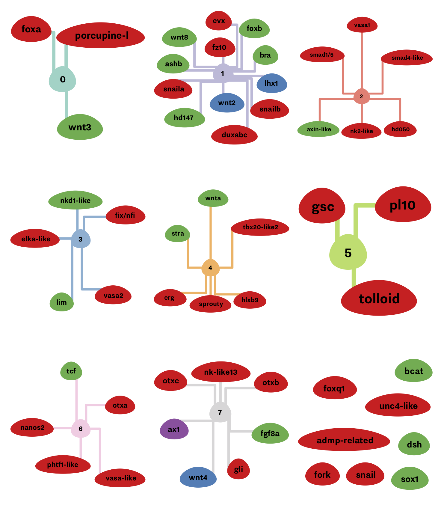
You probably need some knowledge of biology and gene regulatory network 1, but the main idea here is that if genes are connected to each others and are having the same colors, then are correlated both in time, and space, i.e., appearing at the same time and place in the organism.
-
Amir M Abdol et al. “A novel technique to combine and analyse spatial and temporal expression datasets: A case study with the sea anemone Nematostella vectensis to identify potential gene interactions”. English. In: (June 2017). DOI: 10.1016/j.ydbio. 2017.06.004. ↩
A Better Visualization